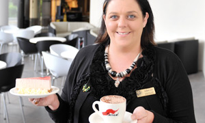
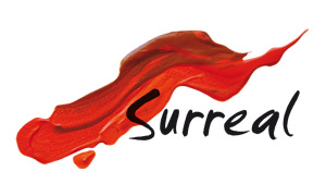
The Surreal logo was one that we made for Norths Leagues for their new cafe after their recent renovations. The brief was for something very different, that would look great on a coffee cup and would be instantly recognisable icon for the cafe.
We started with the font, something different that was still highly legible and had a certain funk to it that would set it out from the "helvetica" logos of the world. Once we found that we wanted to create something really unique for the background that would set the text off and still keep with the aesthetic that we were trying to achieve. We grabbed some paints and a canvas from the local art store and started experimenting with different strokes and swooshes until one was created that really stood out.
We took a high res photo of the final artwork and laid the text we had chosen onto it and it fitted perfectly. Again a very simple logo with a lot of process behind it that when done correctly will hopefully produce a result that the client loves… Which they did.
Back to Portfolio


